When you spend a lot of time building something, it gets harder to see it the way a first-time visitor would. What feels obvious to you might not be obvious to anyone else. My experience page had this exact problem.
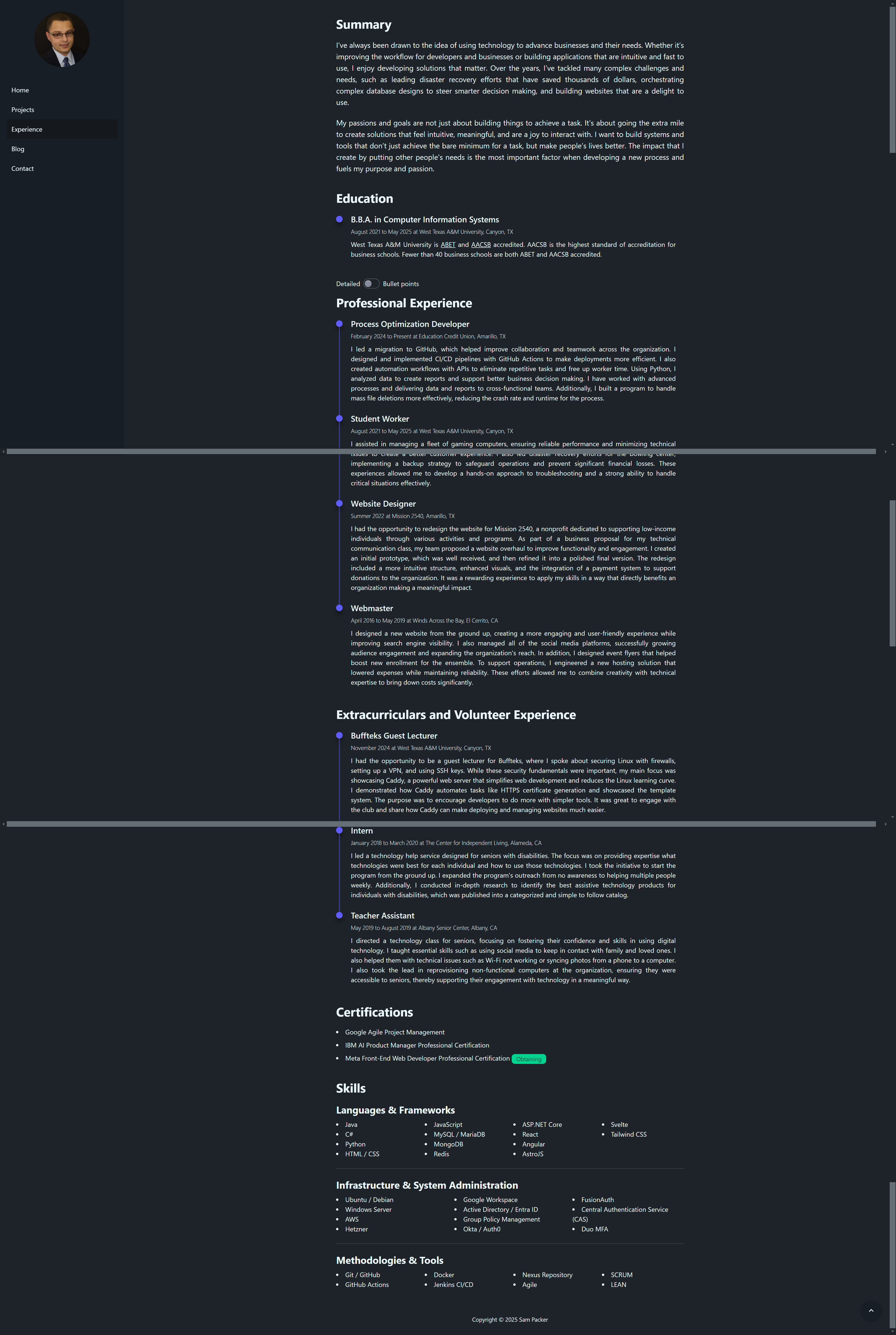
The page was packed with information: a summary, my education, work experience, volunteer experience, skills, and certifications. The content itself wasn’t the issue. The problem was that everything was dumped on the page at once with no visual hierarchy to guide the eye. It was a wall of text. There were visual elements like a timeline, section titles, and appropriate padding, but that wasn’t enough on its own. The page needed to be interactive in some way to make all that information manageable.
The first attempt: adding a toggle
My first revision was adding a toggle that let users switch between a detailed view and a bullet point view. The thinking was, “we can show a simple view first, and if they want more detail, they can switch.” The detailed view was task-oriented and meant to tell more of a story, while the bullet point view was aimed at recruiters with action words and measurable results. It was a nice addition, but it didn’t actually solve the core problem. The wall of text was still there, just slightly rearranged.
I realized I was treating the symptoms, not the root cause. The page needed a complete overhaul.
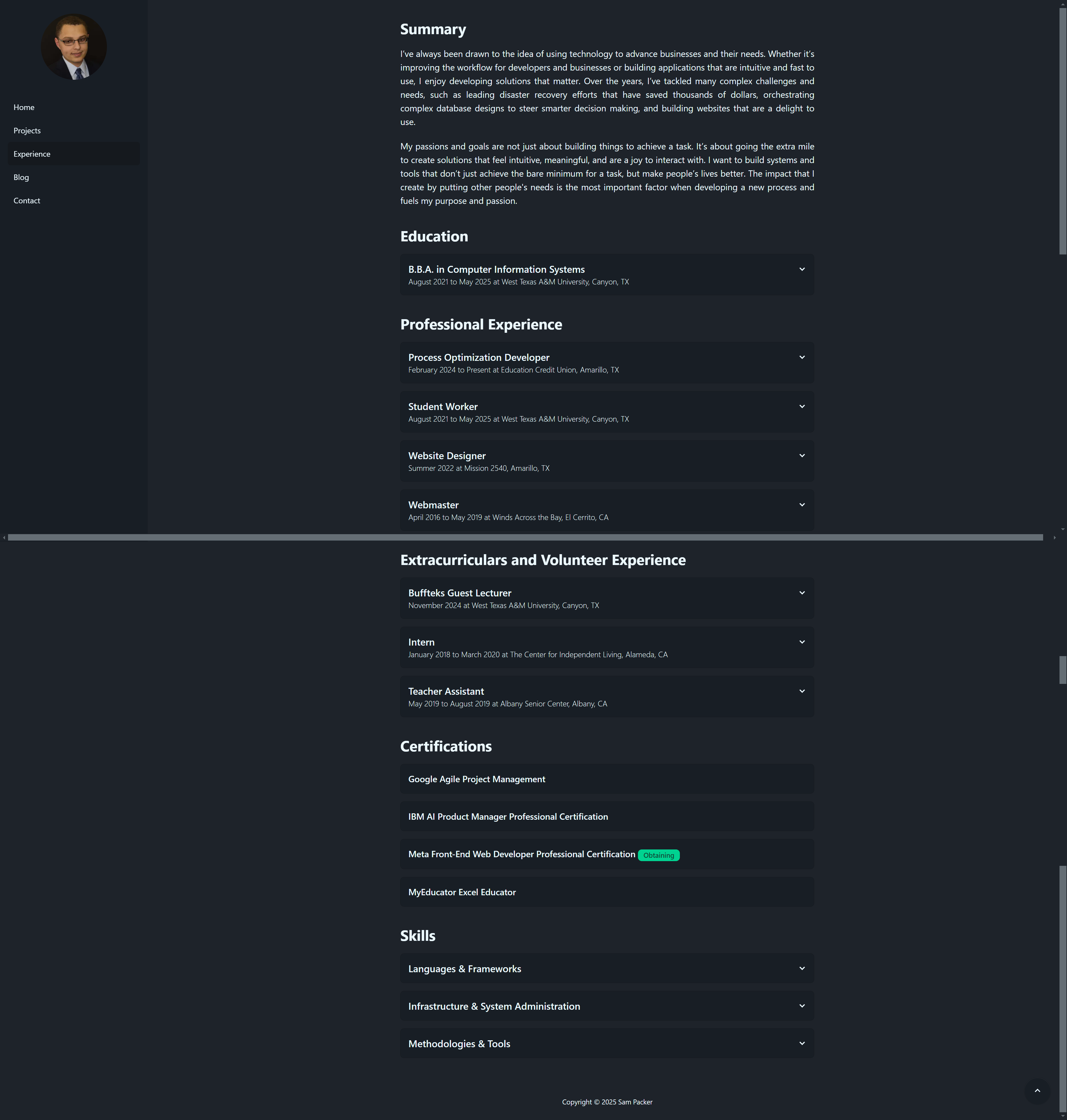
The solution: collapsible cards
After going back to the drawing board more times than I’d like to admit, I finally landed on collapsible cards. Each card shows the title, location, and dates worked. When you click on it, it expands to reveal more details. I gave the expanded cards a different background shade and added a hover animation to signal that they were interactive.
The result is that it’s no longer a wall of text. You see scannable information at a glance, and you can dig into whatever interests you. The bigger titles draw attention to the roles themselves rather than the specific details underneath. This is an important distinction from a résumé, where you want your contributions front and center for a recruiter. On a website, the expectations are completely different. Visitors expect scannable, visual layouts, not dense paragraphs.
The role of analytics
Analytics played a big part in how I made these decisions. For example, I noticed a lot of visitors were coming from LinkedIn. I had a “Let’s connect!” button on my front page, but no one clicked it. It makes sense when you think about it: if someone’s visiting my site from LinkedIn, they’re probably already connected to me. It was redundant, and the data made that clear.
It also turned out that people were more interested in my GitHub than my LinkedIn. However, the link to my GitHub was buried in the bottom left of the page. I moved it to the front page so people now have the option of going straight to my GitHub or viewing the projects on my site. On that note, it’s worth keeping your GitHub README files in sync with your portfolio. You don’t want someone to miss that you have a live demo of one of your applications, for example.
The metric I cared about most for the experience page was the bounce rate. At first glance, it seemed low. However, when I dug deeper, I realized what was actually happening: people were scrolling through the home page, clicking on the experience page, getting overwhelmed by the wall of text, and leaving. The data was misleading. To the untrained eye, it could’ve looked like people were engaging with the page when they actually weren’t. Since making these revisions, the results have been positive. People consistently visit my projects page after my experience page now, which they didn’t before. Pageviews are up overall, and the drop-off after the experience page has decreased.
The pass/fail reality
A hard truth I’ve learned is that your portfolio and résumé don’t get graded out of 100. They’re pass or fail. Either someone’s impressed and wants to know more, or they’re not. There’s no “That’s an 85%, here are some improvements.”
That’s why every detail matters. If someone has to work too hard to find what they’re looking for, they’re not going to stick around. That was actually my initial consideration when choosing the software stack for this website. I wanted something that could deliver a fast and smooth experience, and that starts with keeping the stack simple and lean.
Keep iterating
Redesigning this page taught me a lot about iteration. You’re not going to get a design right on the first try, and the revision process always takes longer than building the initial version. A lot of people build out their portfolio, call it good enough, and never touch it again. I try to spend time every day experimenting and making changes. A lot of those experiments never go anywhere, but that’s how you find the ones that do. The job market is competitive, and your portfolio needs to be fast, accessible, and error-free to even get a second look.